.png?width=300&name=Ontwerp%20zonder%20titel%20(18).png)
A Step-by-Step Guide to Creating an Online Style Guide
Last updated: October 3, 2025
Is your brand consistent online? Your company should be equipped with an online style guide that makes sure your voice is clear and consistent. An online style guide is a list of brand guidelines, including language and visual styles. This document ensures the message you convey through your website, social media accounts, online ads, email campaigns, and more are consistent throughout all touchpoints.
Creating an online style guide can be simple. It just takes some love for organization and attention to detail.
As marketers, we know the importance of branding to help customers remember our business and keep them coming back for more. We also understand how important it is to stay consistent with that brand throughout all online properties: social media, websites, blog posts, videos… you name it.
By implementing a style guide, you can keep your voice consistent, your messaging cohesive, and your brand strong, alluring, and addictive. In other words, you can't attain seamless brand management without a style guide in place.
In this blog, we'll discuss what an online style guide is, what to include in the guide, and why you need it. We'll also give you a rough style guide template to make it easy for you to emulate the nitty-gritty.
Ready? Grab a cup of coffee, kick your feet up, and let's get started!
What to Include in Your Online Style Guide?
First things first, the definition.
A style guide is a concise, well-written resource that dictates how your brand should look to the outside world. This includes the color scheme, typography, imagery, or anything in between, a style guide makes sure that it's all in tandem with your brand image and voice.
Still elusive? Here's a different, more subtle definition: an online style guide is a set of elaborate instructions that act as a reference resource for defining your voice and brand image. Now that you know a thing or two about the famed style guide, let's jump straight into the details. Below, we answer your most pressing question: what to include in an online style guide.
Item 1: Logo
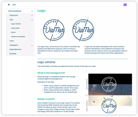
Your company's logo is its public profile. It's critical that you clarify how your logo should be utilized in various situations.

For starters, your online style guide should include detailed information on how to align your logo. Take note that while the center-vertical alignment is an industry standard, other angles can be used to create emphasis or highlight certain elements in your design.
Here are some additional logo guidelines to consider:
Space around the logo
There should be sufficient space around the logo to let it breathe and prevent its visual impact and clarity from being obstructed. This seems like a no-brainer but let's say someone wants to put your logo into a cramped little corner. Perhaps that's all the space they have, or maybe they just like putting images at the far end of any document. Looking at your style guide, they will know not to do that.
Logo size
This is a very straightforward point in your brand guidelines: set a minimum size for your logo. The minimum size for digital use is ideally in pixels. That said, setting proportional values is as important as setting a minimum size. It is absolutely crucial for your logo to have sizing consistency across letterheads, over various products, and on digital applications.
Your minimum size and proportional value guideline could be as simple as:
- Do not use our full logo unless there is ample space to allow for its legibility
- Do not stretch or distort
Or as specific as:
- Our favicon must always be 14 x14 pixels
- The minimum digital size for both our logomark and wordmark is 18 pixels
Description
Spelling out what your logo is and isn't dictates how your logo should be used at all times. Think of the times someone mispronounces your name, and you have to correct them. Assuming that people will "just know" what your logo is about won't gel well with your desire to have a strong brand identity. As such, give your logo a proper description—answer the how and why of your logo in a few crisp words.
Item 2: Font Preference
Next up on our style guide must-haves is the font preference, otherwise known as typography. Your brand needs will dictate whether one typeface family will meet all of your needs or if you want to utilize multiple fonts. A good rule of thumb is to use a different font than the one in your logo since the contrast will help it stand out.
No matter how simple or sophisticated your typography scheme is, make sure it's used in all the correct ways by explaining different choices and giving clear instructions for use.
- Introduce: Tell the story of the typefaces you're using, how they relate to your brand, and what each one is used for (captions, headlines, body texts, etc.)
- Spacing: Include kerning and tracking ratios to maintain a consistent style when font size changes
- Alignment: Be forthright on whether you want copy to align left, right, or centered.

Item 3: Color Scheme/Pallete
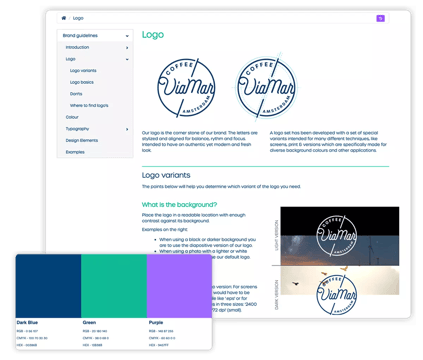
A brand's online style guide needs to outline each and every color used across all channels: social media, website, print materials etc. Prioritize and order the colors accordingly too: primary, secondary and tertiary colors.
The online style guide should specify which colors are associated with your brand along with their hex codes, recommended use, and any other relevant information.
Defining a color scheme will go a long way towards creating a consistent look and feel.
Item 4: Imagery
When it comes to the imagery section of your style guide, there are no hard and fast rules. It's your taste that really pulls the weight here. Everyone else will have to adjust accordingly.
Here are different ways to approach this section:
- Mood board: Pull together images that portray the feeling that you want to evoke when people interact with your brand.
- Best practice: Share examples of images that have performed extremely well for your brand. While at it, be sure to emphasize how your company communicates best, be it through Facebook or Instagram.
- Aspirational: Sometimes, you may not have the right images to display as examples—and that's totally fine. In such a situation, turn to bigger brands for inspiration. This will still give your team a sense of style to align to, and who knows, they might even eclipse those big brands.
Item 5: Tone/Voice
Lastly, but certainly not least, we have the brand voice. Your voice is all about positioning yourself in a way that helps your brand stand out from the rest, leave a lasting impression, and be easily identified. Having a style guide is key to nailing your brand voice time and again—without fuss or complication.
When creating brand voice guidelines, pay attention to these proven tips:
- Always refer back to your brand's personality traits: A strong brand personality should reflect the values your company stands for, expressing these through every linguistic choice that is made. For example, if your main value is "sustainability," you might have to put emphasis on inclusive pronouns like "we" or "our" to indicate your orientation towards collectivity, as opposed to individualism.
- Mind the context: Your voice-specific brand guidelines should include references to every type of media that you use to communicate, and the rules that go with them.
- Provide tons of examples: Describing your tone of voice as "human" or "innovative" doesn't really help those whose task is to translate or create copy for your brand. Stay away from generic terms and provide as many on-brand/off-brand examples as possible.
Now that we've shown you how to create the perfect online style guide, let's now look at the why of it all.
Why You Need a Style Guide
In a nutshell, an online style guide helps ensure a consistent brand experience. It means that no matter how, when, or where a customer experiences your brand, they're experiencing the same underlying traits. It's this consistency across all touchpoints that helps build trust, a brand, and brand voice. And with 4.66 billion internet users around the world (and growing), it's really more critical than ever for businesses to establish a comprehensive style guide.
Online Style Guide Template
Again, there are no hard and fast rules for creating a style guide template. Your business-specific wants and needs should be your guiding light here, your North Star.
Keeping in mind the five key elements of a style guide, here's a rough example of a template you could use:
Logo
- Here's our logo and what it means to us
- How to use (and to use) our logo
Front Preference/Typography
- These are the fonts we use and why we chose them
- This is our main typeface. Oh, how beautiful!
- These are our secondary typefaces
Color Scheme
- Here are the colors that best describe our brand
- Here's how to mix and match our colors
Imagery
- These are our on-brand images
- Here's how to lay them out
Tone/Voice
- This is our tone of voice and how best to describe it
- Here are the do's and don'ts when it comes to our brand voice
Keep your Brand Strong With an Online Style Guide
There are no concrete rules for creating an online style guide. However, it ideally should be a flexible, ever-changing document. You'll want to make sure that essential information is accessible and accurate at all times.
This means no style guide should be static. Style guides in PDFs are the past and online style guides that are part of a more extensive brand management system are the future. With Marvia's Digital Brand Guidelines, your guidelines are always accessible online and directly connected to the corresponding brand assets in the DAM.

Treat this blog as a rough guideline—and educational resource to help you make informed decisions. But above all, remember that a style guide is a no-brainer. Without it, your brand is bound to be haphazard, unappealing, and pretty much unrecognizable in the eyes of your online customers (and your team). Do your due diligence and get it locked in right now.
Need more branding tips? Check out Marvia blog and get first-hand nuggets straight from our branding experts.
Ready to establish a centralized style guide for your brand? Schedule a demo and see how Marvia can simplify the process, ensuring consistency across all your communications.
